Show code
library(tidyverse)
library(tidycensus)
library(sf)
library(ggplot2)
library(leaflet)
library(tigris)
census_api_key("42bf8a20a3df1def380f330cf7edad0dd5842ce6")Demonstrating tidycensus and spatial analysis
This is simply some sample analysis showing students how to document their work professionally.
This is not a real assignment for this course!
library(tidyverse)
library(tidycensus)
library(sf)
library(ggplot2)
library(leaflet)
library(tigris)
census_api_key("42bf8a20a3df1def380f330cf7edad0dd5842ce6")Let’s example how median income varies across the city of Philadelphia
# Get Philadelphia County data
philly_income <- get_acs(
  geography = "tract",
  variables = "B19013_001", # Median household income
  state = "PA",
  county = "Philadelphia",
  geometry = TRUE,
  year = 2022,
  progress = FALSE
)

# Clean the data
philly_income <- philly_income |>
  filter(!is.na(estimate)) |>
mutate(income_k = estimate / 1000) # Convert to thousands for easier reading# Basic summary
summary(philly_income$estimate) Min. 1st Qu. Median Mean 3rd Qu. Max.
14983 39596 58514 63883 82809 181066 # Histogram
ggplot(philly_income, aes(x = income_k)) +
geom_histogram(bins = 30, fill = "steelblue", alpha = 0.7) +
labs(
title = "Distribution of Median Household Income",
subtitle = "Philadelphia Census Tracts, 2022 ACS",
x = "Median Household Income (thousands)",
y = "Number of Census Tracts"
) +
theme_minimal()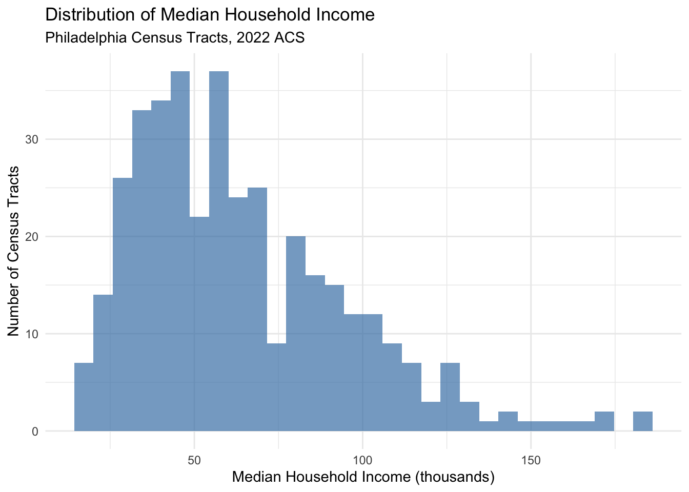
# Create income classes
philly_income <- philly_income |>
mutate(
income_class = case_when(
income_k < 25 ~ "Under $25k",
income_k >= 25 & income_k < 50 ~ "$25k - $50k",
income_k >= 50 & income_k < 75 ~ "$50k - $75k",
income_k >= 75 & income_k < 100 ~ "$75k - $100k",
income_k >= 100 ~ "$100k+"
),
# Convert to factor to control order
income_class = factor(income_class,
levels = c("Under $25k", "$25k - $50k", "$50k - $75k",
"$75k - $100k", "$100k+"))
)
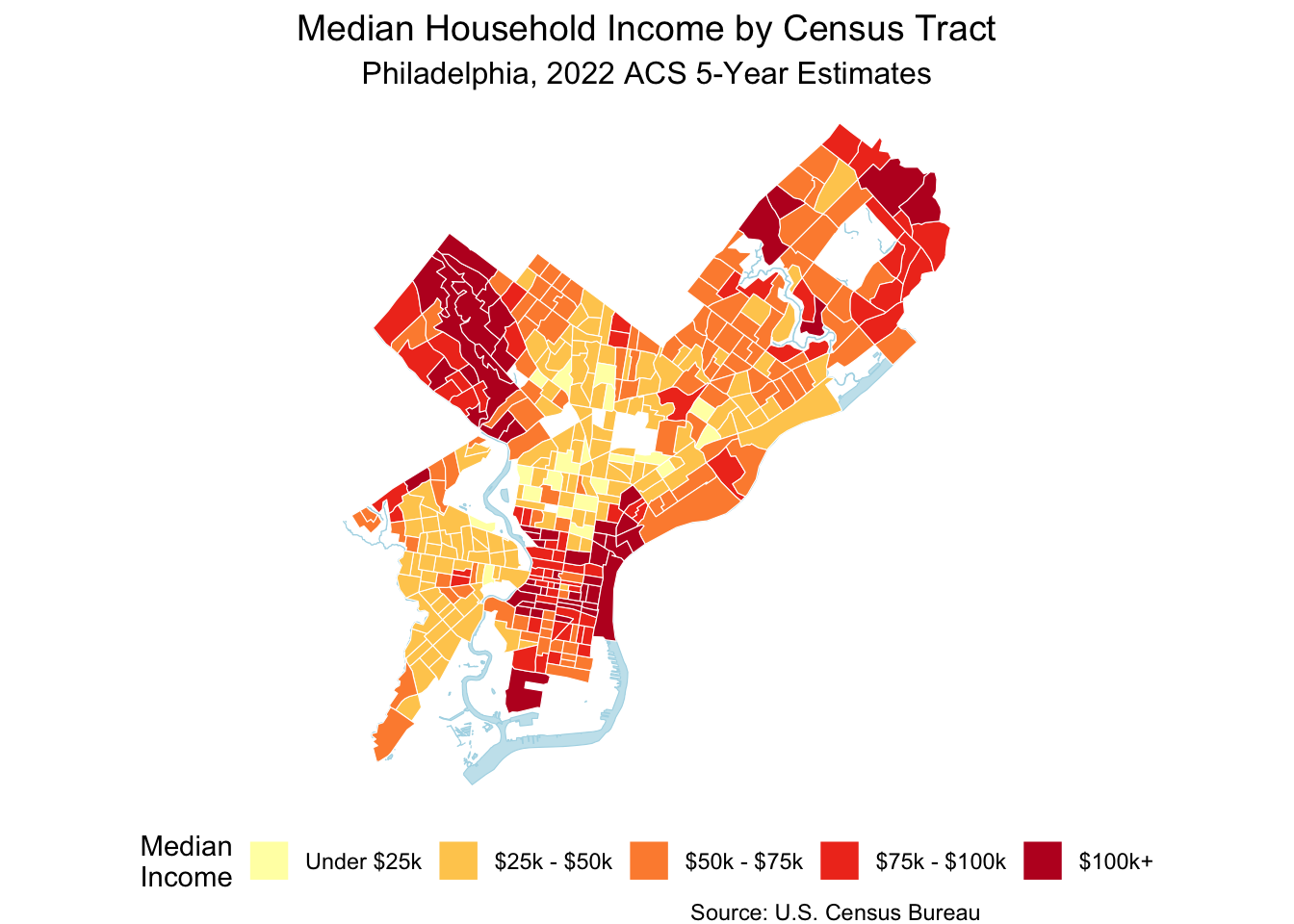
# Create choropleth map with classes
ggplot <- ggplot(philly_income) +
geom_sf(aes(fill = income_class), color = "white", size = 0.1) +
scale_fill_brewer(type = "seq", palette = "YlOrRd", name = "Median\nIncome") +
labs(
title = "Median Household Income by Census Tract",
subtitle = "Philadelphia, 2022 ACS 5-Year Estimates",
caption = "Source: U.S. Census Bureau"
) +
theme_void() +
theme(
plot.title = element_text(size = 14, hjust = 0.5),
plot.subtitle = element_text(size = 12, hjust = 0.5),
legend.position = "bottom"
)
# Get water features for Philadelphia
philly_water <- area_water(state = "PA", county = "Philadelphia",
year = 2022, progress = FALSE)
# Add to your map
ggplot() +
# Water first (background)
geom_sf(data = philly_water, fill = "lightblue", color = "lightblue", alpha = 0.7) +
# Then census tracts on top
geom_sf(data = philly_income, aes(fill = income_class), color = "white", size = 0.1) +
scale_fill_brewer(type = "seq", palette = "YlOrRd", name = "Median\nIncome") +
labs(
title = "Median Household Income by Census Tract",
subtitle = "Philadelphia, 2022 ACS 5-Year Estimates",
caption = "Source: U.S. Census Bureau"
) +
theme_void() +
theme(
plot.title = element_text(size = 14, hjust = 0.5),
plot.subtitle = element_text(size = 12, hjust = 0.5),
legend.position = "bottom"
)